.png)
Roles & Responsibilities
-
Lead Designer (user flow, low-fidelity wireframing, high-fidelity wireframing, styling, mock-up), no other team members.
.png)
.png)
Problem & Resolution
While Spirit Halloween is the largest Halloween retailer in North America, they do not have a mobile app to ease the experience for their consumers. Every year, those who are shopping for the season are doing so for numerous reasons. So developing a mobile application could offer the consumers a smooth and clean navigation system for an efficient shopping experience.
.png)
Project Overview
Retail company that sells a large array of products, mostly targeted towards Halloween and Horror.
-
Colorful and fun products with a simplistic design.
-
Large, well-known company with products varying in cost and style to pertain to a wide, diverse demographic.
-
Sold online and in-store (seasonally)
Users & Audience
The company consists of a wide variety of users.
This includes:
1. Teens and young adults looking for costumes to wear to school events and parties with their friends.
2. Middle-aged Halloween lovers looking to deck out their front lawn for the season.
3. Parents, grandparents, and guardians costume shopping for the children in their lives.
4. Year-round Halloween and horror fanatics browsing for décor for their homes as well as apparel pieces for their wardrobes.
The Process
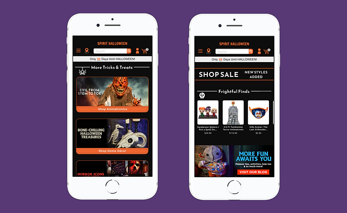
I first started off with analyzing Spirit Halloween’s existing desktop and mobile site. Due to the wide range of users, the landing page on their site contains a lot of information and products. Taking their existing flow into account, I began creating a low-fidelity wireframe for their landing page. The layout was designed to offer the user a good amount of products and information without being overstimulating.
It was then on to styling. I took swatches of the colors used on Spirit Halloween’s site and saved some of their images that I felt stood out and were prime, eye-catching products for promotion to keep the user wanting to browse the page. Lastly, I chose the font options. For the app I wanted to go with a more subdued wordmark, opposed to the website which included their logo. Therefore, Francois One as the chosen font style for the wordmark was to maintain the Halloween-feel without looking out of place or overdone. The font I chose for the sectional headers I wanted to offer a Halloween vibe to as well. So I chose Reem Kufi Fun which has some sharp edges and a fun, somewhat unconventional flow to it that I found to be perfectly peculiar.
With my style guide now laid out, I began creating the high-fidelity wireframe. As I began adding character to the page it went through a few looks and some trial and error. Specifically with which sections and images I felt needed to stand out above the crowd and which background color would compliment them well. I chose Spirit Halloween’s orange color as the product's primary color. At first I laid it down as the background color to really push that fall / Halloween feel. I very much liked this color and wanted to incorporate it in the design, but as I began adding product images the background color no longer seemed to compliment the products well. I decided to go with a black for the background which seems to make the products pop and give the app a spooky and sleek, yet professional look.
One of the main areas of importance to be as I designed the landing page was keeping a casual flow. Considering Spirit Halloween’s products are all unique and vary in color, I wanted to make sure the user wouldn't be perplexed on where they were on the page. I decided to go with a mix of shapes and corner roundness to visually notify the user that they were in and / or approaching a different section within the page. Additionally, I highlighted certain product categories such as “Shop By Theme” with the primary color and some light inner shadowing. Spacing was another thing I felt was very important in relaying this message. To have sections not too far from one another so that the user was aware the page and products continued on, but just enough spacing so as to not overwhelm or confuse the user. And lastly, as the page started to come to life I began adding Halloween-inspired icons (cto) to embellish the main sections of the page to fully establish a navigational system.